//EN
Technology for everyone.
In 2019 Débora created eu.developer, based on the desire to talk about technology and social transformation. Here, eu.developer can also be one who develops people. For as a social worker, Débora believes that her job is to develop the best of people, and as a programmer, to develop the best software. In the near future the business will become a socially-oriented technology startup.
//PT-BR
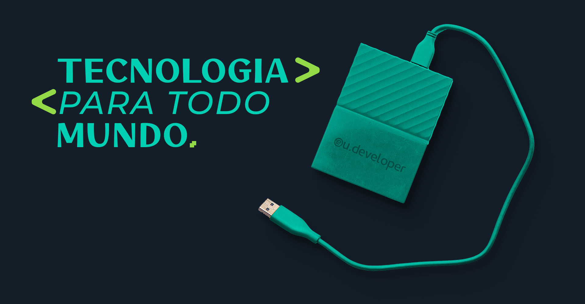
Tecnologia para todo mundo.
Em 2019 Débora criou a eu.developer, partindo do desejo de falar sobre tecnologia e transformação social. Aqui, eu.developer também pode ser aquele/a que desenvolve pessoas. Pois como assistente social, a Débora acredita que seu trabalho está em desenvolver o melhor das pessoas, e como programadora, desenvolver o melhor software. Em um futuro próximo o negócio se tornará um startup de tecnologia voltada para o social.

//EN
The eu.developer is a unique project, which has at its base the technology as a tool for social transformation. We can then say that it is a junction between the scientific, technological, and the human, subjective.
The challenge for the project was to bring a modern brand, but one that could express itself in a pleasant way. This junction needed to be innovative and involving, going beyond the technological.
The challenge for the project was to bring a modern brand, but one that could express itself in a pleasant way. This junction needed to be innovative and involving, going beyond the technological.
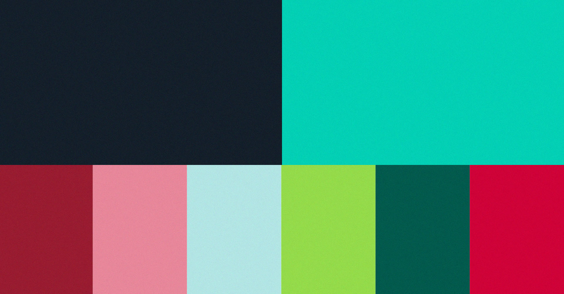
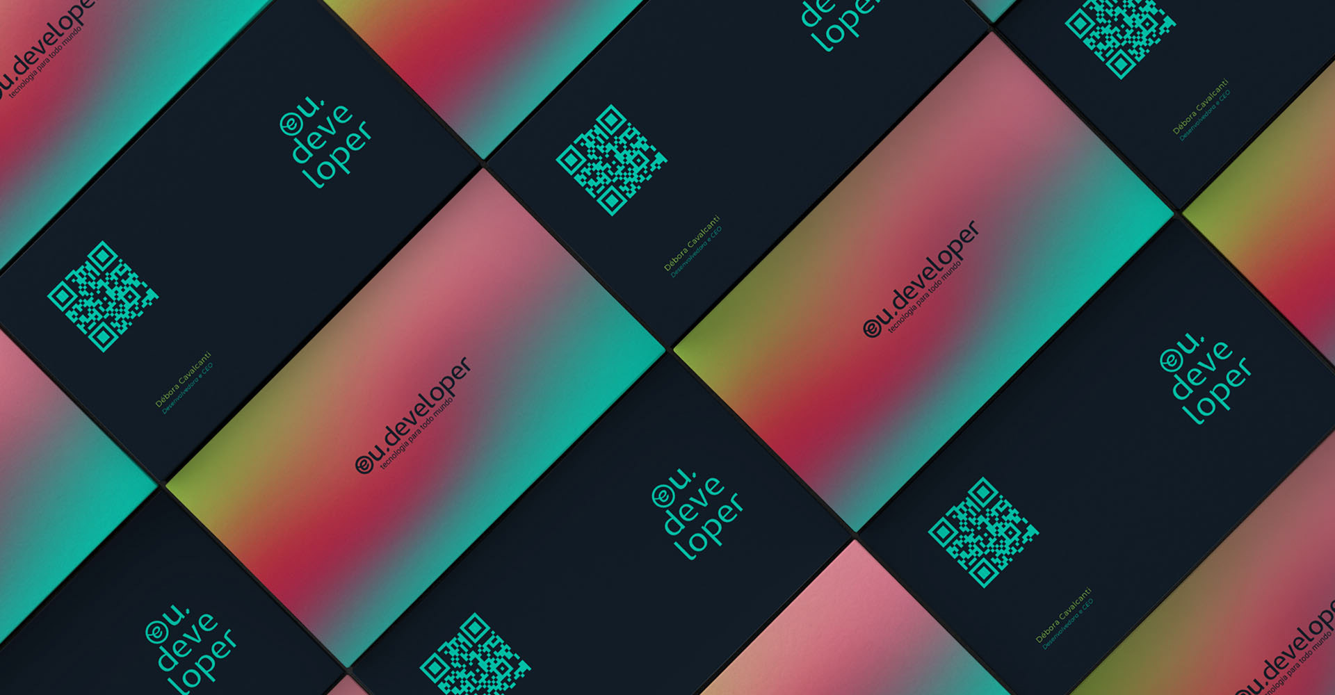
Another challenge was Debora's request for the project. Bringing the colors red and green, which represent social assistance. Even knowing the possible difficulties in its application, we needed to find a way to bring this request to the project.
//PT-BR
A eu.developer é um projeto singular, que tem em sua base a tecnologia como ferramenta para a transformação social. Podemos dizer então que é uma junção entre o científico, tecnológico, e o humano, subjetivo.
O desafio para o projeto foi o de trazer uma marca moderna, mas que pudesse se expressar de forma agradável. Essa junção precisava ser inovadora e envolvente, indo além do tecnológico.
O desafio para o projeto foi o de trazer uma marca moderna, mas que pudesse se expressar de forma agradável. Essa junção precisava ser inovadora e envolvente, indo além do tecnológico.
Outro desafio, foi o pedido da Débora para o projeto. Trazer as cores vermelho e verde, que representam a assistência social. Mesmo sabendo das possíveis dificuldades na sua aplicação precisávamos encontrar uma forma de trazer esse pedido para o projeto.

//EN
With all the revolutionary power that technological means have brought to the world, we need to think about a relationship in which these resources are increasingly at the service of the human, of a common good and not that we are dependent on them, therefore, our intention was to bring a timeless concept, since changes happen in a frenetic way, and juxtaposed, "where there is technological evolution that human evolution is together.
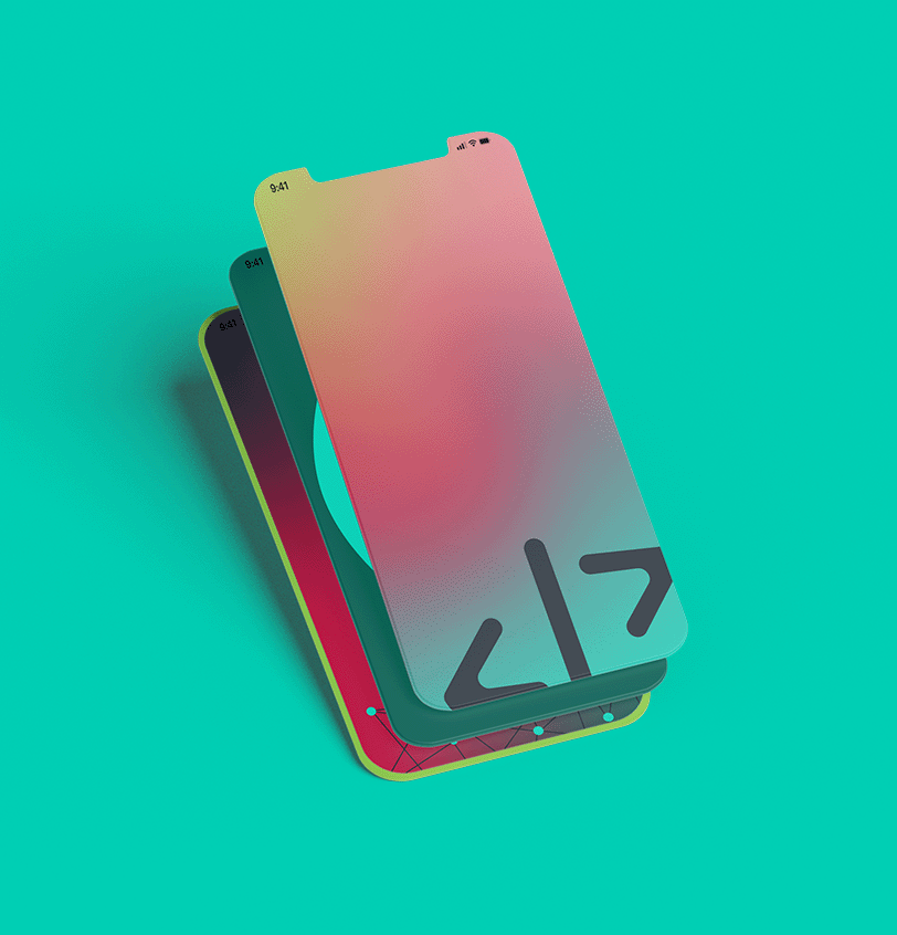
In the information system the @ is a computer symbol that separates the user's name and the provider's address, it signals where the user is. We realize that @ is an open symbol that tells us: I can be anywhere!
From this reference, we seek to convey the idea that the self is part of a whole. May "it" expand or retract, the self is there, always connected. That is, in society we are agents and reactors, we are transformers and transformed. This connection follows in the whole of the brand, through the curves that refer to sensibility, and lines, parallels and diagonals that take us to all the technological possibilities. Besides the understanding that social transformation is only possible from the creation, articulation, and strengthening of networks, in the case of eu.developer, technological networks and human networks.
From this reference, we seek to convey the idea that the self is part of a whole. May "it" expand or retract, the self is there, always connected. That is, in society we are agents and reactors, we are transformers and transformed. This connection follows in the whole of the brand, through the curves that refer to sensibility, and lines, parallels and diagonals that take us to all the technological possibilities. Besides the understanding that social transformation is only possible from the creation, articulation, and strengthening of networks, in the case of eu.developer, technological networks and human networks.
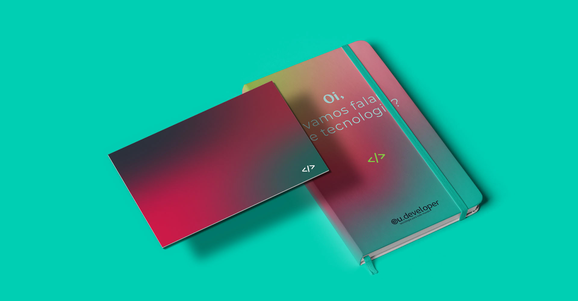
Answering Débora's request, we did some contrast tests with the colors red and green, in order to bring the best result in its application. Realizing that we wouldn't have a good response using the colors in the main palette, in the brand, we opted to bring them in the secondary palette. Being applied along with some other colors and tones.
//PT-BR
Com todo o poder revolucionário que os meios tecnológicos tem trazido ao mundo, precisamos pensar numa relação em que estes recursos estejam cada vez mais a serviço do humano, de um bem comum e não que sejamos dependentes destes, por isso, nosso intuito foi trazer um conceito atemporal, uma vez que as mudanças acontecem de maneira frenética, e justaposto, “onde houver evolução tecnológica que a evolução humana esteja junta”.
No sistema de informação a @ é um símbolo informático que separa o nome do utilizador e o endereço do provedor, sinaliza onde o utilizador está. Percebemos que @ é um símbolo aberto que nos diz: posso estar em qualquer lugar!
A partir dessa referência, buscamos transmitir a ideia de que o eu é parte de um todo. Que “ele” se expanda ou se retraia, o eu está ali, sempre conectado. Ou seja, na sociedade somos agentes e reagentes, somos transformadores e transformados. Essa conexão segue no todo da marca, através das curvas que remetem à sensibilidade, e linhas, paralelos e diagonais que nos levam a todas as possibilidades tecnológicas. Além do entendimento de que transformação social só é possível a partir da criação, articulação e fortalecimentos de redes, no caso do eu.developer, redes tecnológicas e redes humanas.
A partir dessa referência, buscamos transmitir a ideia de que o eu é parte de um todo. Que “ele” se expanda ou se retraia, o eu está ali, sempre conectado. Ou seja, na sociedade somos agentes e reagentes, somos transformadores e transformados. Essa conexão segue no todo da marca, através das curvas que remetem à sensibilidade, e linhas, paralelos e diagonais que nos levam a todas as possibilidades tecnológicas. Além do entendimento de que transformação social só é possível a partir da criação, articulação e fortalecimentos de redes, no caso do eu.developer, redes tecnológicas e redes humanas.
Atendendo ao pedido da Débora, fizemos alguns testes de contraste com as cores vermelho e verde, afim de trazer o melhor resultado na sua aplicação. Percebendo que não teríamos uma boa resposta usando as cores na paleta principal, na marca, optamos por traze-las na paleta secundária. Sendo aplicada junto a mais algumas cores e tons.

//EN
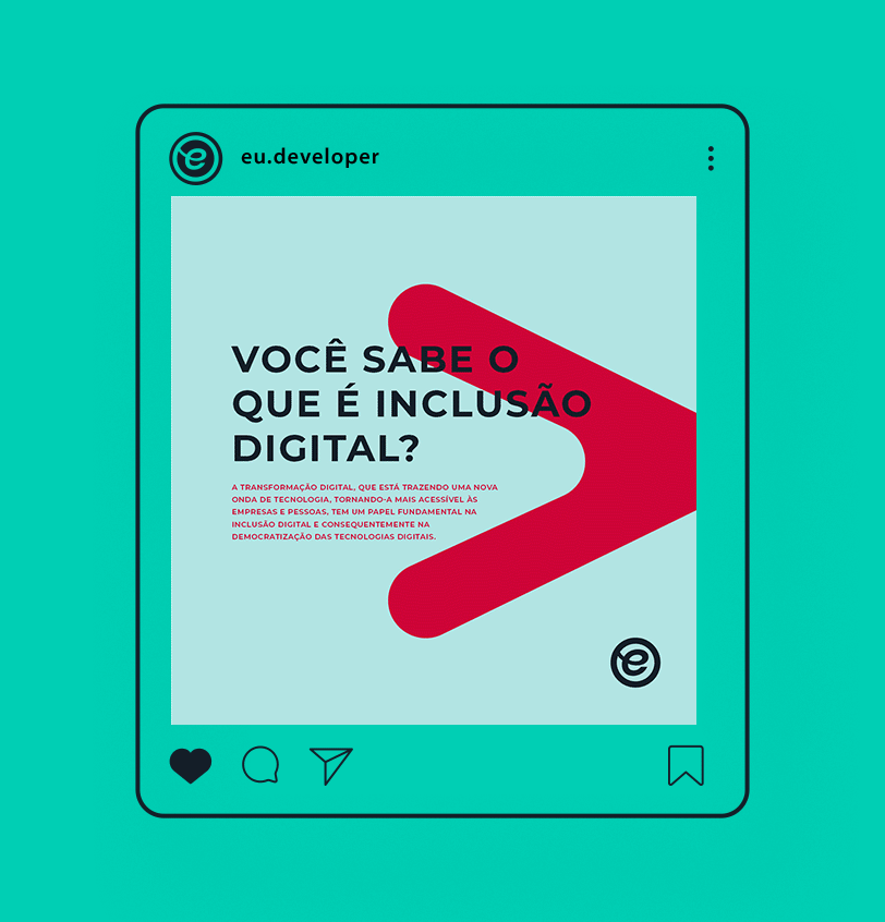
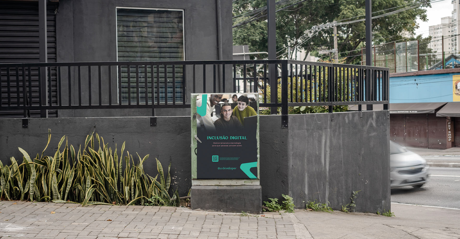
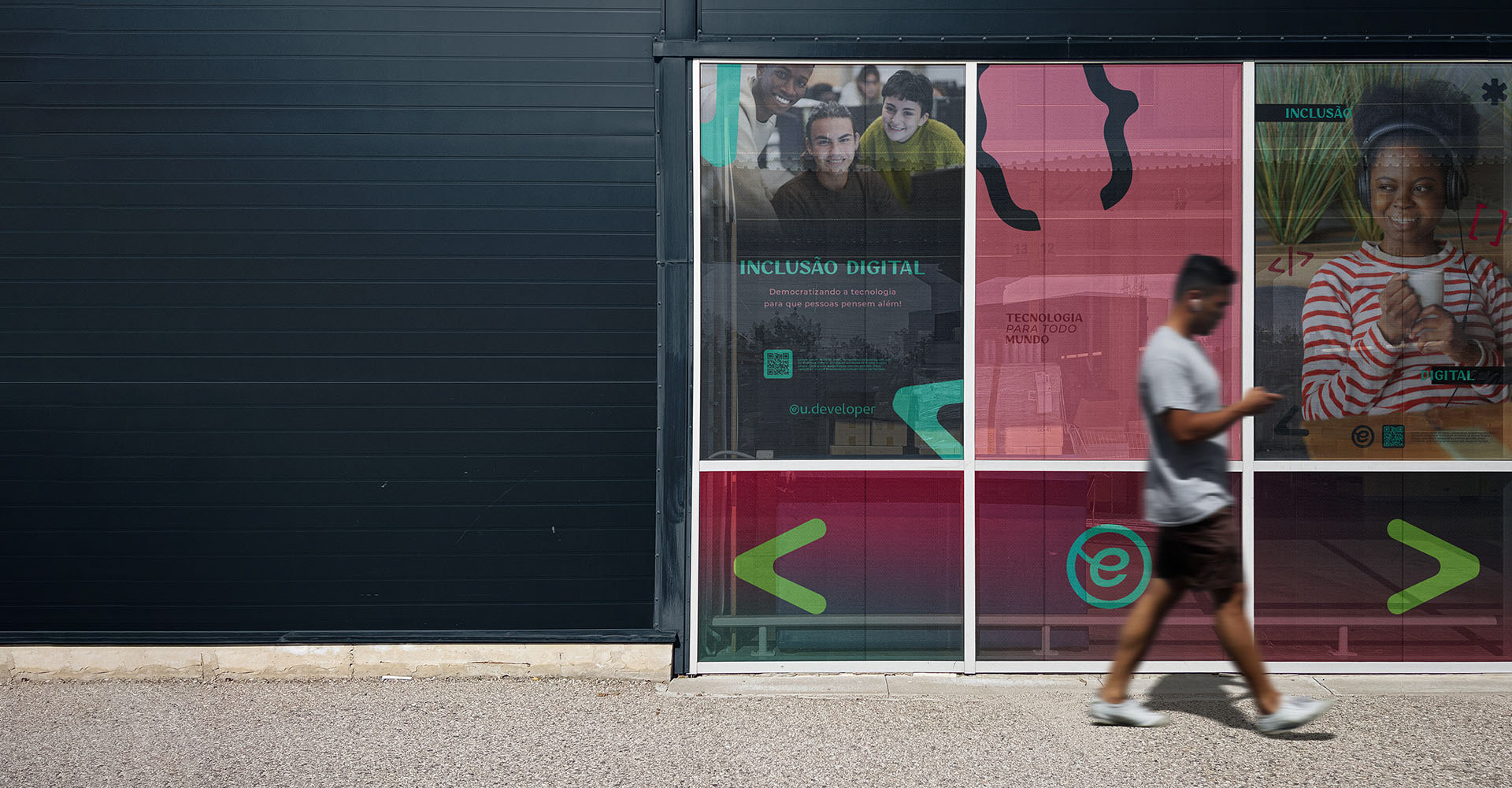
The eu.developer has a very important role in fostering and disseminating themes such as technology in social assistance, educational technology, and digital inclusion, in social networks and lectures. Therefore, it was essential that we structured the project in order to meet this demand. We created templates for presentations and publications on social networks, aiming to bring autonomy to the creation of content, with all the guidelines for application of the visual identity provided.
//PT-BR
A eu.developer tem um papel importantíssimo de fomentar e disseminar temas como, tecnologia na assistência social, tecnologia educacional e inclusão digital, nas redes sociais e palestras. Por isso, foi fundamental que estruturássemos o projeto afim de atender esta demanda. Criamos templates para apresentações e publicações em redes sociais, com o objetivo de trazer autonomia ae criação dos conteúdos, com todas as diretrizes de aplicação da identidade visual fornecida.

Deliverables:
Brand Strategy, Brand and Visual Identity
Credits:
Kesya Tavares – Brand Strategist & Graphic Designer
_____
KESYA TAVARES - BRAND DESIGNER ©2021 • All Rights Reserved